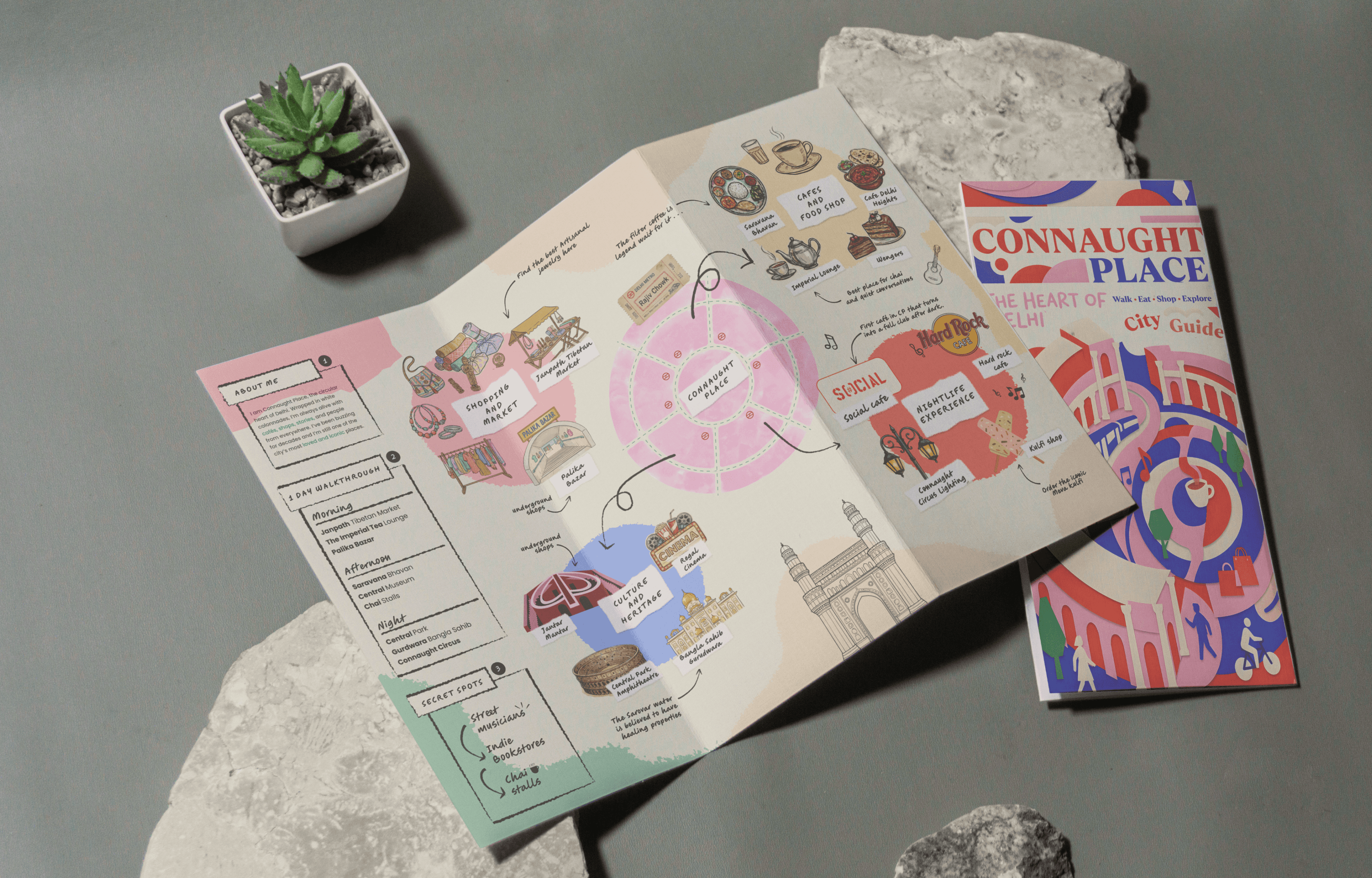
Designing a clear, accessible, and heritage - sensitive wayfinding system for Connaught Place, improving navigation and the overall public experience.
Wayfinding
Signage Design
Role
Product Designer
Timeline
3 Months
team
2 Designer, 2 Researchers
platform
Environmental Design

The Real Problem
Connaught Place is one of New Delhi's busiest commercial and cultural destinations, welcoming thousands of commuters, shoppers, office workers, and tourists every day. Despite its iconic circular layout, navigating the area is often confusing, especially for first-time visitors. Inconsistent signage, missing directional cues, and fragmented information often force people to rely on mobile maps instead of the physical environment.
The challenge goes beyond simply finding a destination. Visitors struggle to identify the correct block, locate nearby landmarks, and understand the relationship between the Inner Circle, Outer Circle, and connecting roads. Existing signboards differ in placement, design, and information hierarchy, making navigation more confusing than helpful.
User observations revealed recurring frustrations:
"I know the place I need to visit is in Connaught Place, but I have no idea which block I'm standing in."
"My maps keep changing direction. I wish the signage around me was enough."
"There are signboards everywhere, but none of them clearly tell me where to go."
The underlying issue was not the lack of signage. It was the absence of a unified wayfinding system. Over time, information had been added without a consistent visual language, hierarchy, or user centered approach. As a result, one of India's most visited public spaces lacked a clear and intuitive navigation experience.

Finding the Fix
I started by studying the existing wayfinding system across Connaught Place, documenting sign locations, pedestrian movement, decision points, and information hierarchy. After conducting site observations and analyzing user behavior, three key problems stood out:
No clear navigation flow. Visitors often couldn't tell where they were or which direction to take next.
Inconsistent information hierarchy. Signboards varied in layout, typography, and content, making information difficult to scan and understand.
Disconnected wayfinding experience. Maps, directional signs, and identification markers functioned independently instead of as a unified system.
The research made one thing clear. People navigate cities by recognizing landmarks, confirming their location, and following consistent cues. The existing system interrupted that journey with fragmented information and inconsistent visual language.
So I focused on three fixes:
A clear information hierarchy. Organize content so users can quickly identify their current location, destination, and next direction.
A unified visual language. Standardize typography, icons, colours, and layouts to create a consistent experience across every sign.
A modular signage system. Design flexible sign types that work together seamlessly while adapting to different locations and user needs.
All achievable within the existing urban environment, creating a scalable wayfinding system without disrupting the character of Connaught Place.

What Actually Happened
I developed multiple concepts and refined them through site observations, usability thinking, and feedback from peers and mentors. Reviewing the designs in the context of the actual environment helped identify what worked and what created unnecessary visual clutter.
For example, my initial layouts included more information on directional signs. While everything was technically useful, users needed to make decisions within seconds. Reducing the amount of information and prioritizing destinations made the signs much easier to scan.
The kiosk design also evolved during the process. My first concept focused on presenting as much information as possible, but it felt overwhelming. I redesigned the interface with a clearer map hierarchy, recognizable landmarks, and simplified navigation, making it easier for visitors to orient themselves at a glance.
I also refined typography, color coding, iconography, and sign placement to improve visibility from different distances and viewing angles. Each iteration brought the system closer to a cohesive wayfinding experience that was both functional and visually consistent across Connaught Place.

What Changed
The redesigned signage system transformed navigation into a more intuitive and consistent experience. By introducing a unified visual language, structured information hierarchy, and modular signage, visitors could orient themselves more confidently and move through Connaught Place with less confusion.
The final solution delivered:
Clearer navigation. Visitors could quickly identify their location, choose the right direction, and confirm they were on the correct path.
Better readability. Standardized typography, color coding, and iconography made information easier to scan from different distances.
A cohesive wayfinding system. Directional signs, kiosks, maps, and identification markers worked together as a single connected experience instead of isolated elements.
The project demonstrates how thoughtful wayfinding design can improve the usability of public spaces. Rather than adding more signs, the focus was on presenting the right information at the right place, helping people navigate confidently while preserving the architectural identity of Connaught Place.

What I Had to Work With
The project required balancing user needs with the realities of a busy public environment. Since this was a conceptual redesign based on research, I relied on site visits, user observations, secondary research, and an analysis of the existing wayfinding system to identify recurring navigation issues and opportunities.
The design also had to respect the architectural identity of Connaught Place. Any proposed signage needed to blend with the heritage character of the space while remaining highly visible, durable, and accessible for a diverse range of users.
The solution had to be practical and scalable. Instead of redesigning isolated signboards, I focused on creating a unified wayfinding system that could be implemented consistently across the entire precinct, improving navigation without disrupting the existing urban environment.

What I'd Do Differently
I'd conduct more usability testing with a broader range of visitors, including tourists, daily commuters, and first time users. Observing how different people navigate the space would uncover additional opportunities to refine the system.
I'd also validate sign placement through real world testing. Factors such as viewing distance, pedestrian flow, and environmental conditions can significantly influence how effectively people notice and use way finding elements.
What I Learned
A successful wayfinding system is about more than designing attractive signboards. It is about delivering the right information at the right moment, helping people make confident decisions as they move through a space.
Consistency creates confidence. When typography, colors, icons, and layouts follow a unified visual language, users spend less time interpreting signs and more time navigating naturally.
Designing for public spaces requires balancing functionality, accessibility, and context. Every sign must be easy to understand, durable, inclusive, and respectful of the surrounding architecture.
This project strengthened my understanding of environmental graphic design, information hierarchy, and human-centered navigation, reinforcing how thoughtful wayfinding can improve the everyday experience of thousands of people.