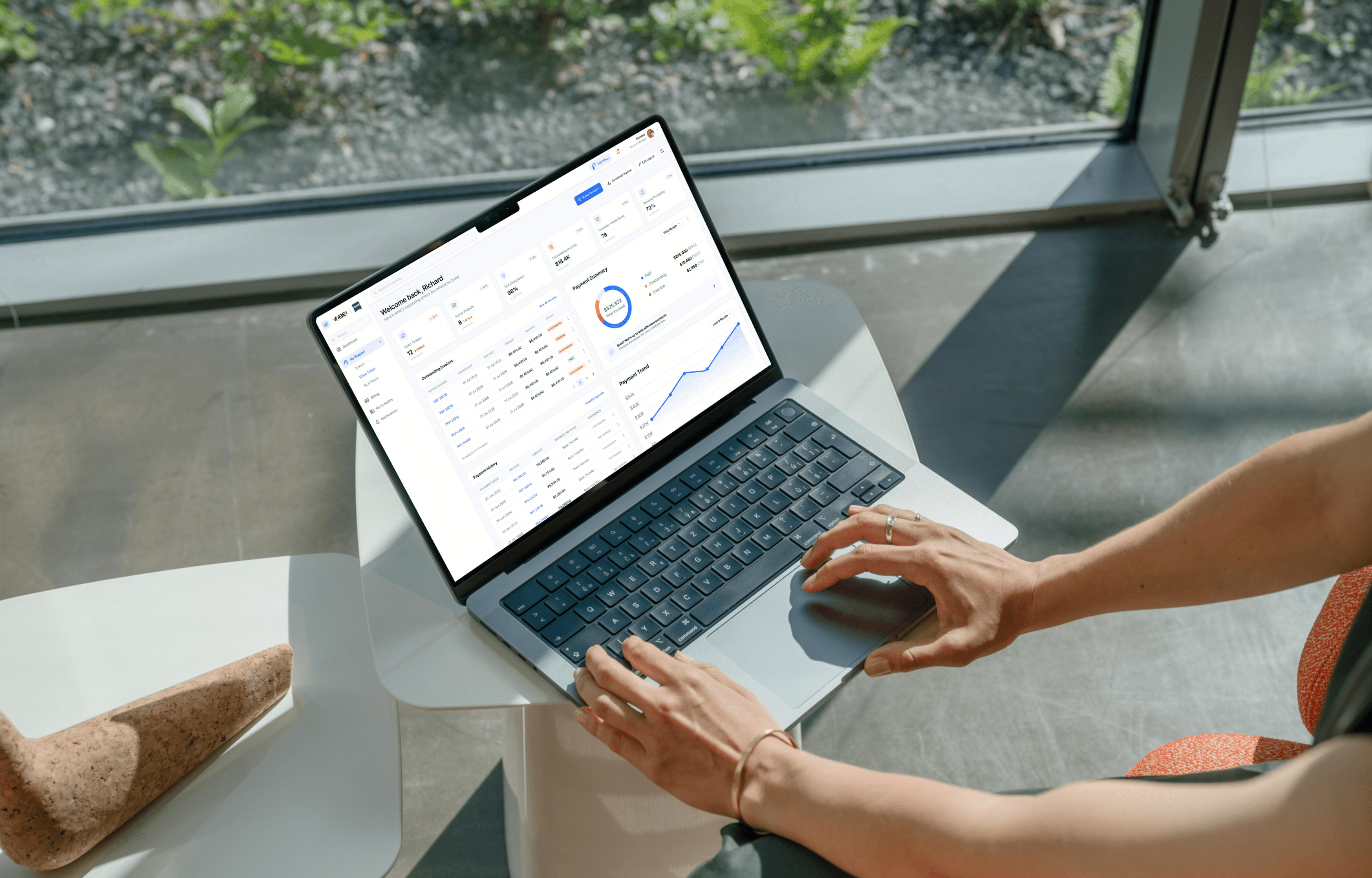
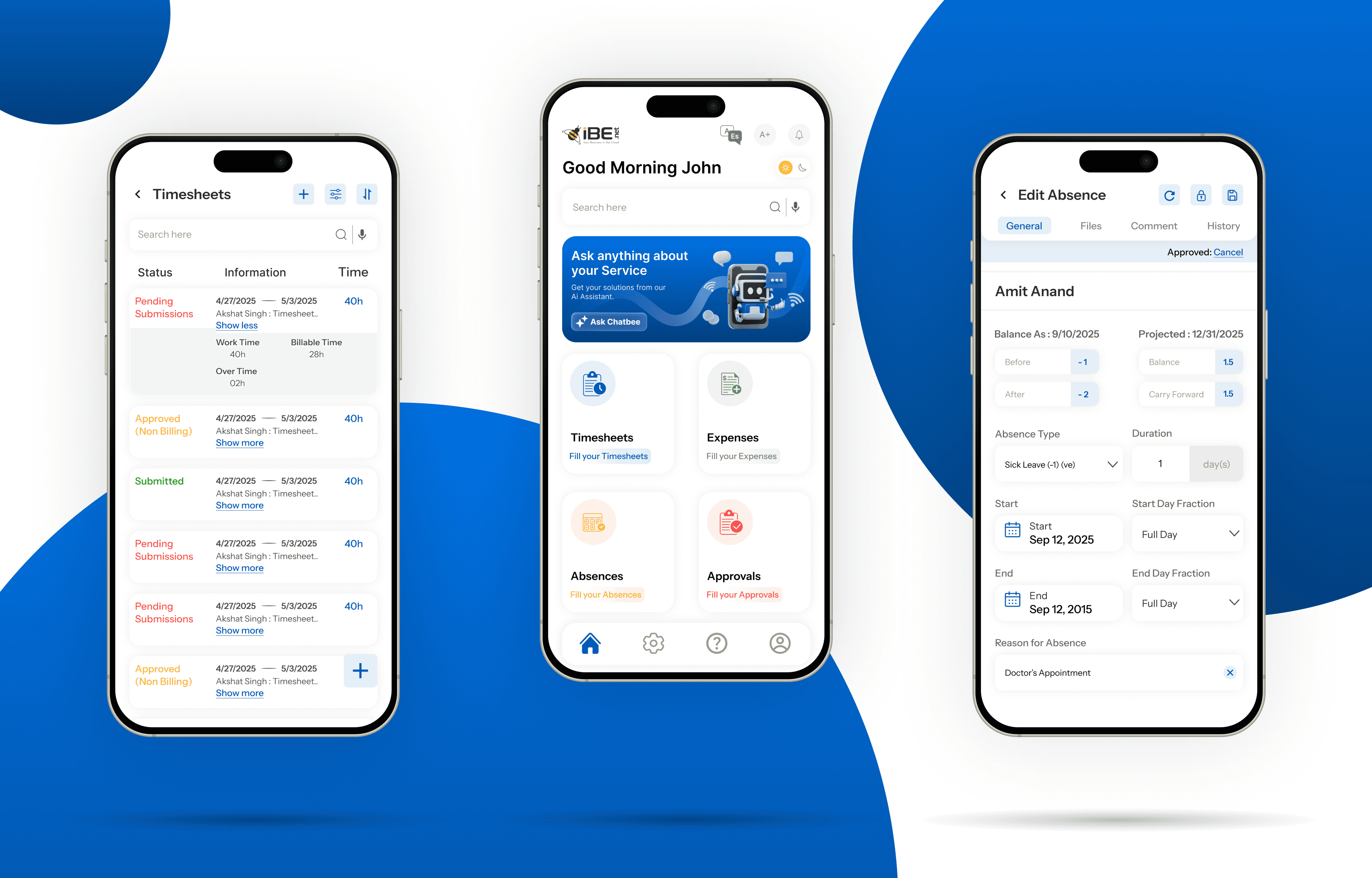
Led the redesign of an enterprise platform during its rebranding, modernizing the desktop and mobile experience while preserving familiar workflows.
SaaS
Transformation
Role
Product Designer
Timeline
12 months
team
1 designer
platform
Web and mobile app

The Real Problem
Users at iBE.net were managing dozens of tasks, timesheets, and expense entries every single day. Each workflow meant clicking through multiple disconnected screens, re-entering the same information across modules, and hoping the session didn't time out before they finished. People were losing progress, losing track of where they were, and spending far longer than they should have on routine tasks they performed constantly.
But here's what made it worse: the interface gave no sense of where you stood in a workflow. Users would think they'd reached the final step of a timesheet or expense report, only to find more fields waiting on the next screen. Navigation between modules was inconsistent; what worked one way on the dashboard behaved differently on the Kanban board. Auto-save was unreliable, so a single misclick could mean redoing several minutes of careful data entry.
The feedback we gathered was direct:
"I can never tell if I've actually finished entering my hours or if there's another screen coming."
"I've had to redo the same expense report more than once this month."
"Why do I have to enter the project name in three different places?"
The underlying issue wasn't just outdated visuals. It was that no one had ever looked at the full user journey end to end. Each module, dashboards, timesheets, expenses, Kanban boards, had been built independently over the company's history, and they'd never been stitched into one coherent experience.

Finding the Fix
I started by mapping the entire multi-screen flow, not just the UI, but how data moved between modules, where duplication happened, and where people got stuck. After analyzing support tickets and user feedback, three problems stood out:
No sense of progress. People couldn't tell where they were in a workflow or what was left to complete.
No safety net. One wrong click and careful work vanished.
Clunky information architecture. Screens were organized by how the database was structured, not by how users actually thought about their work.
The team leads I spoke with described a timesheet or expense report as one continuous task, hours worked, project context, notes, approvals. But the interface chopped that into arbitrary fragments spread across disconnected screens.
So I focused on three fixes:
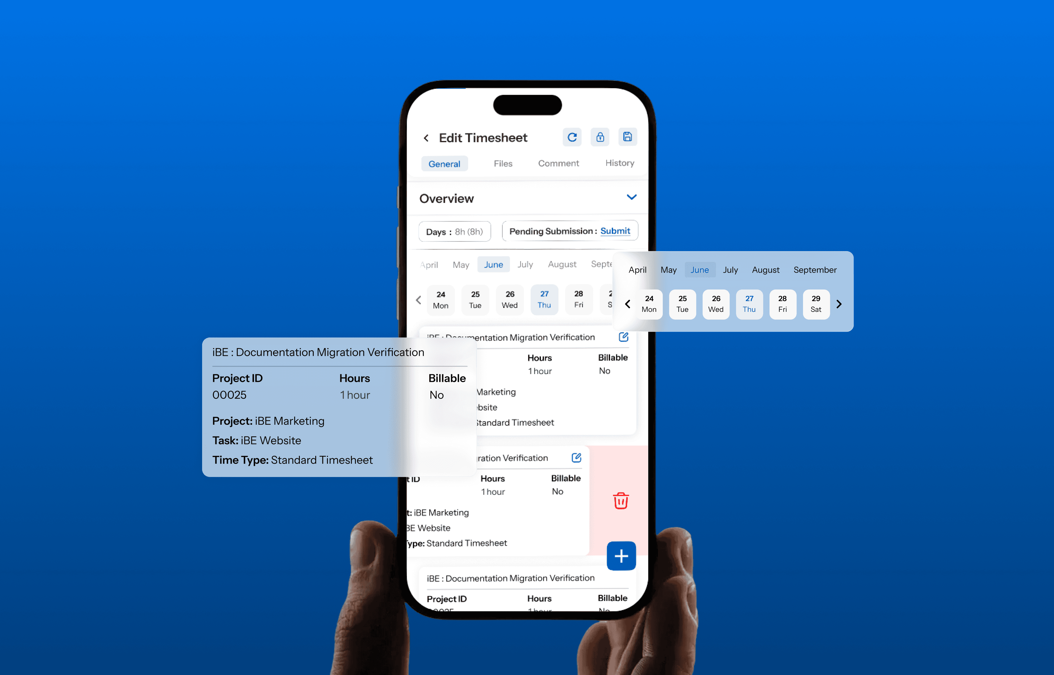
A progress indicator that showed completed sections, the current section, and what remained. Always visible, always clear.
Auto-save with real feedback. Not just saving in the background, but showing users exactly when their work was protected.
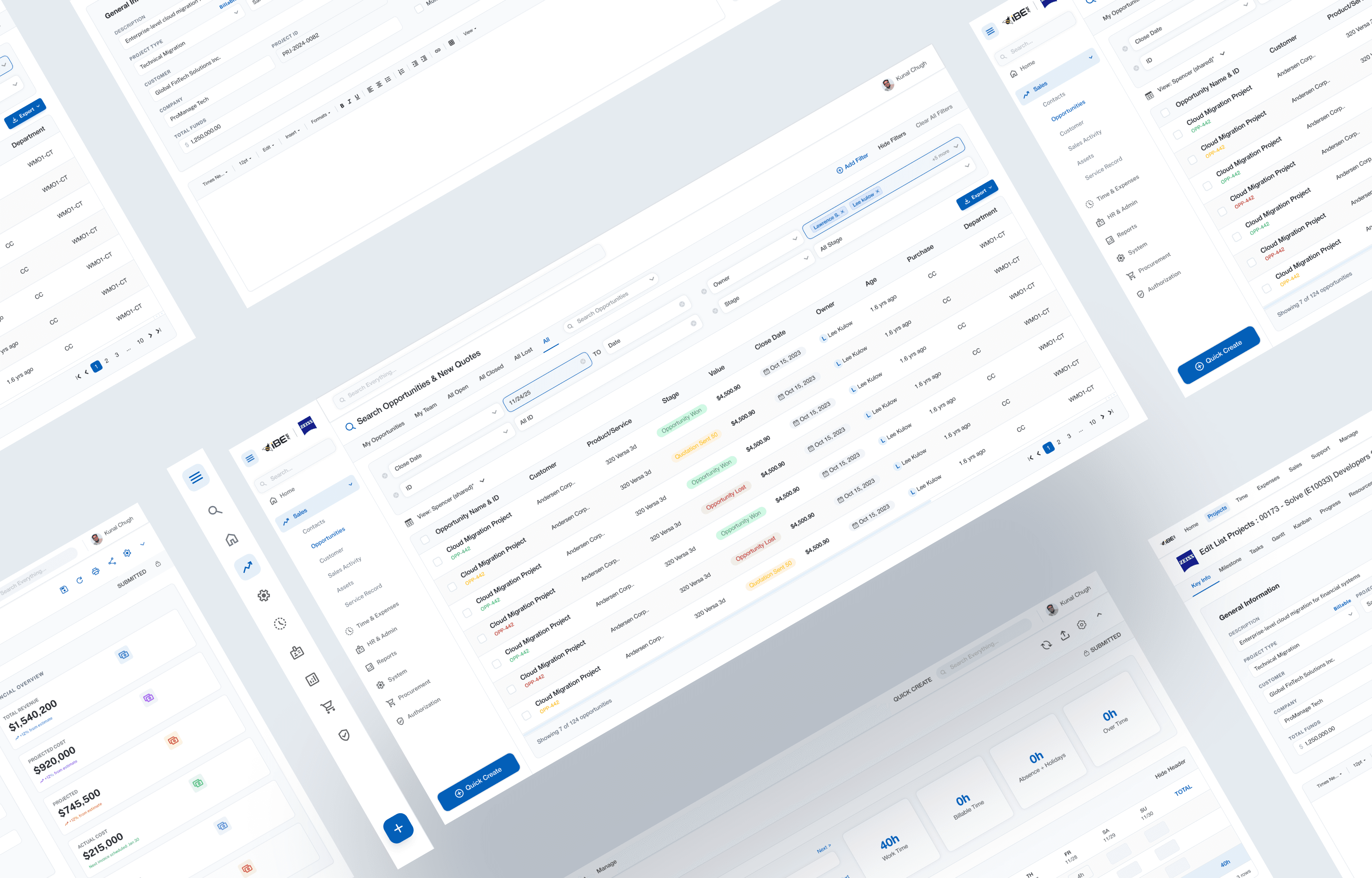
Consolidating screens by grouping related information the way users actually thought about it, rather than the way the underlying data model happened to be structured.
All achievable within our constraints. No backend overhaul required.
What Actually Happened
I wireframed the new flow and tested it with our internal product expert and customer success team, the people who talked to users daily. That's where I caught my mistakes.
For example, I'd grouped "project details" and "task assignments" together because they seemed related. But users think about them at totally different points. Project details get set up before work begins, task assignments get adjusted throughout. Keeping them separate made more sense.
The auto-save design also evolved. My first version showed a brief "Saved" notification that disappeared quickly. Beta testers said they didn't notice it and still felt anxious about losing their work. I changed it to a persistent "Last saved [time]" indicator that updated live. Small tweak, massive difference in confidence.
We shipped to a small beta group first. The response was immediate, users noticed the progress indicator and auto-save within minutes. We adjusted some section labels based on feedback, then rolled it out across the platform.

What Changed
Documentation time dropped from 15-20 minutes to 7-10 minutes. Support tickets about lost work decreased by 78% in the first month. In a follow-up survey, 89% of users said the new system was easier or much easier to use than before.
But my favorite feedback was qualitative:
"This is exactly what I needed. I can finally see where I am."
"I haven't lost a task since the update. Game changer."
"It actually feels like someone asked us what we needed."
Zero people requested to go back to the old version, which felt like the real success metric.
What I Had to Work With
No direct access to end users. Enterprise data privacy agreements meant I couldn't shadow client teams or run live usability tests with them directly. I had user surveys, interviews with internal stakeholders and account managers, and months of support tickets. Not ideal, but enough to identify patterns.
A rigid design system. The platform's ongoing brand refresh meant working within an evolving component library that wasn't fully finalized. Custom one-off solutions weren't an option; I had to design within existing and emerging patterns.
A tight deadline. Leadership wanted improvements shipped fast, alongside the broader brand rollout. A complete rebuild wasn't realistic.
These constraints shaped everything. Instead of reimagining the whole system, I focused on the changes that would have the biggest impact with the least structural upheaval.
What I'd Do Differently
I'd push harder for access to real end users earlier. Working through intermediaries gave me valuable insights, but I missed nuances that only come from watching someone actually struggle with an interface. Even one direct observation session would have accelerated my understanding.
I'd also document existing problems more systematically. I relied heavily on anecdotal feedback and support tickets, which worked, but a proper heuristic evaluation would have given me clearer evidence when advocating for changes.
What I Learned
Strategic improvements beat perfect overhauls. I wanted to rebuild everything into a sleek, unified experience. But given our constraints, that wasn't realistic. The focused changes we made, progress visibility, auto-save, better information architecture, delivered serious value without requiring a ground-up rebuild.
Mental models beat logic. What made sense to me (grouping related data) didn't always match how users actually thought about their work. Validating assumptions with the people who do the work daily saved me from shipping something technically correct but functionally wrong.
Invisible design builds trust. The "Last saved" indicator wasn't technically necessary; the system was auto-saving either way. But it transformed how people felt about the experience. Sometimes the most important design work is making invisible processes visible.